Client
Revived
Revived's mission to offer truly sustainable skincare that benefits our skin and reminds us to care for ourselves and the planet. We have developed Revived's strategy, creative direction, brand identity and packaging. Revived's formulas are 100% their own, they have  developed an innovative process of extracting high-quality coffee oil from used coffee grounds collected from local coffee shops across the UK. Their circular-solutions are leading the way in reducing food waste and eradicating virgin ingredients from skincare, like palm oil, and the impact it has on our planet. It was important for Revived to be as eco-friendly as possible, for that reason the packaging uses GF Smith's Extracted paper range which takes disposable paper coffee cups destined for landfill and transforms them into paper. Upcycled coffee is at the core of the brand, from the ingredients to the packaging.

Photography by Lateral North.
Type of work
Identity, strategy, creative direction & packaging
Revived logo – white text on orange background
Objective
To develop a consumer-facing brand strategy, identity and packaging, that can be adaptable for more product ranges in the future. The design should align with Revive Eco's values of sustainability, community and invention. The packaging should help Revived stand-out within a competitive market. The products will be sold both online and in retail, so they need to convey a sense of nature and freshness in both digital and physical spaces.
Strategy
To define what is important to Revived, and why it matters to their customer, we had to first define their core values – nature, wellness and innovation.

Revived's formulas are 100% their own. Their circular-solutions are leading the way in eradicating virgin ingredients, like palm oil, and the impact it has on the planet. And they are always looking for new innovative ways to deliver high-quality effective products. They innovate so that customers can see effective results. Additionally, the beauty and skincare industry is full of greenwashing and false claims, and customers can see through it. By being open about the upcycling process, they can build trust and a long-lasting community.

The terms 'self-care' and 'wellness' are often used in regards to skincare. Revived believes that real wellness does not require an extensive list of products or obligations. They understand how stressful life can be and aim to inspire their community to take small steps to be kinder to themselves and their skin.
Glass serum bottle with orange label that reads "Revived coffee oil, upcylced nourishing skin oil, 30ml"Two images. Left image is a girl walking up stairs with an orange Revived branded tote bag. Right image is a phone screen showing Revived's instagram grid.Colour palette list, with a wide range of warm tones: oranges, reds and pinks. And deep blues and greens.
Visual identity
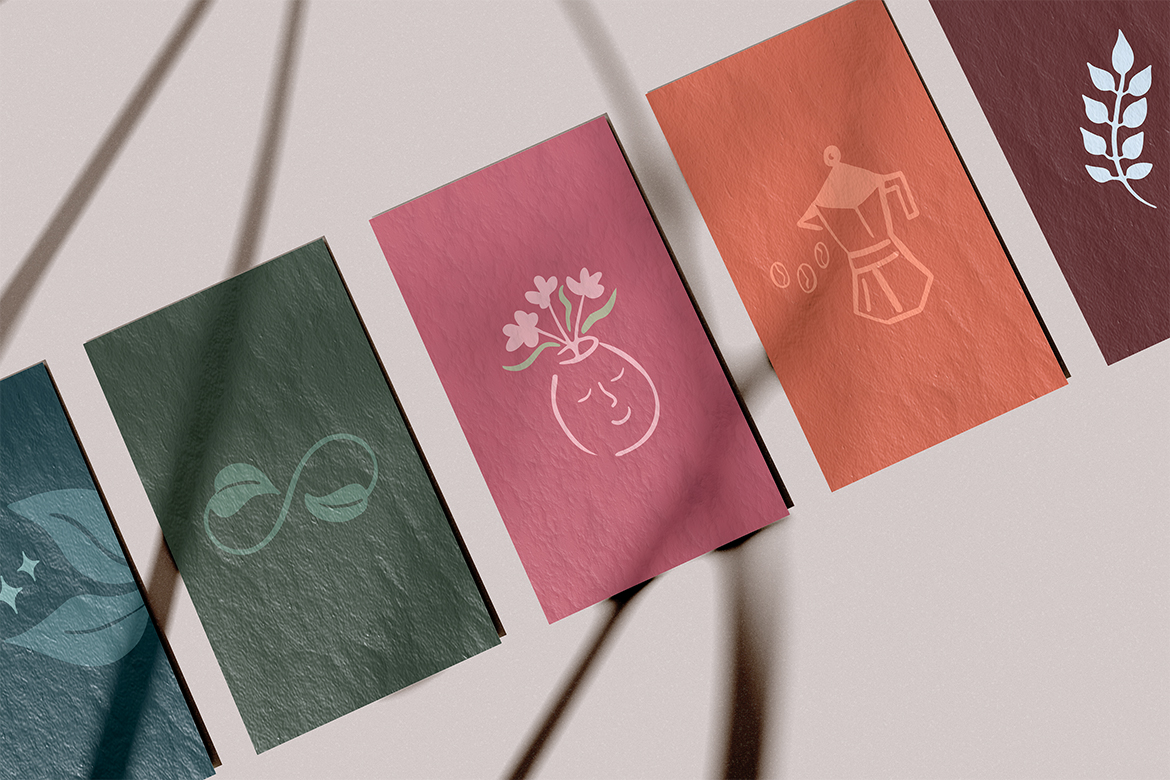
Revived's colour palette has been created to reflect the brands connection to nature, sustainability and to convey a sense of warmth and wellbeing. This palette gives scope to evolve the brand with future product launches, with the option of using colour to identify products, ingredients and scents.

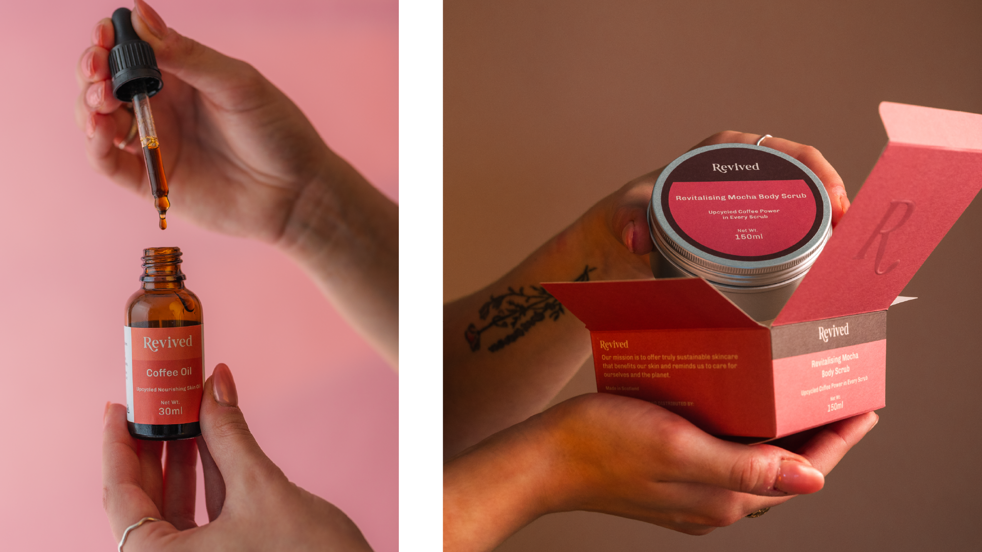
We have used a serif typeface for Revived's logo – which is modern, approachable and authentic. The subtle curve of the 'R' adds a sense of movement and elegantly supports the rest of the word. When the letter 'R' stands alone, it is clear and recognisable, and creates the same impact as the full wordmark.

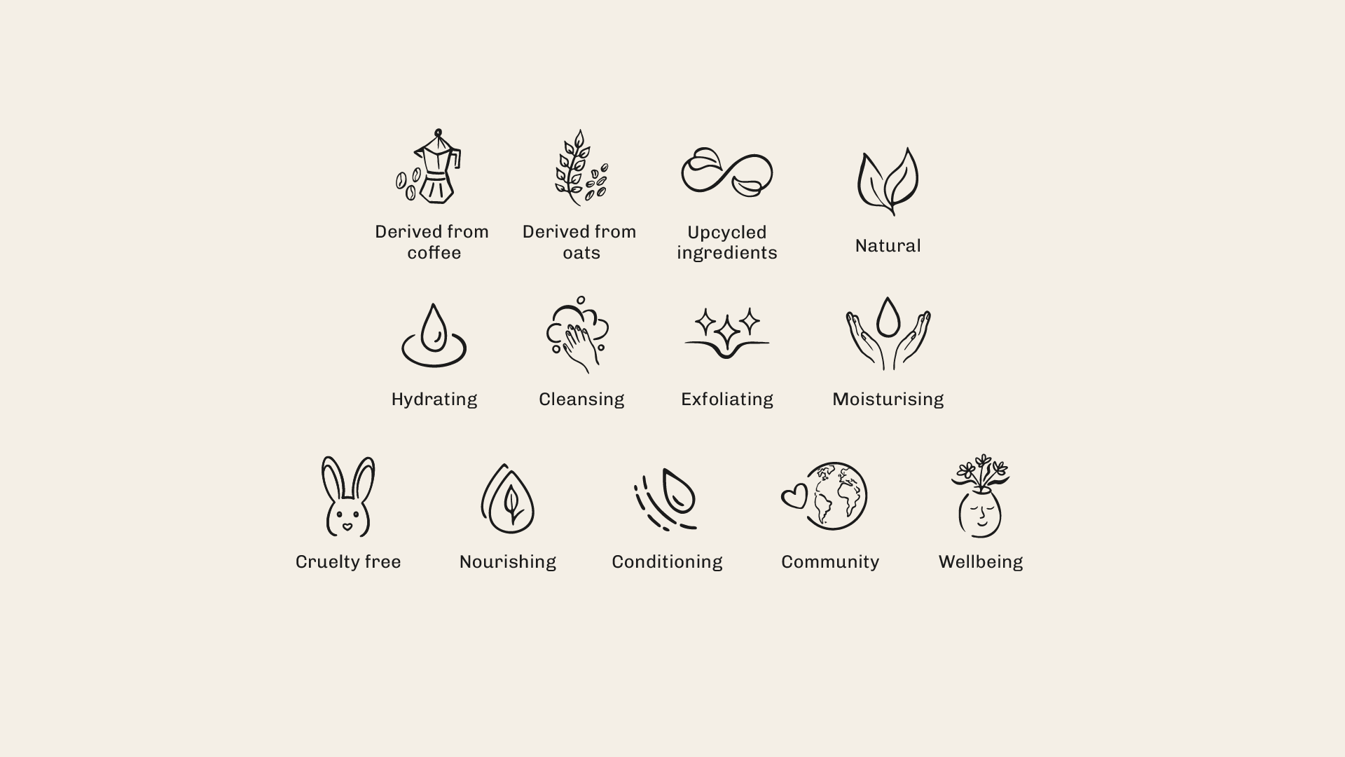
A hand-drawn icon style has been crafted to convey a connection to nature and to offer a personal touch.

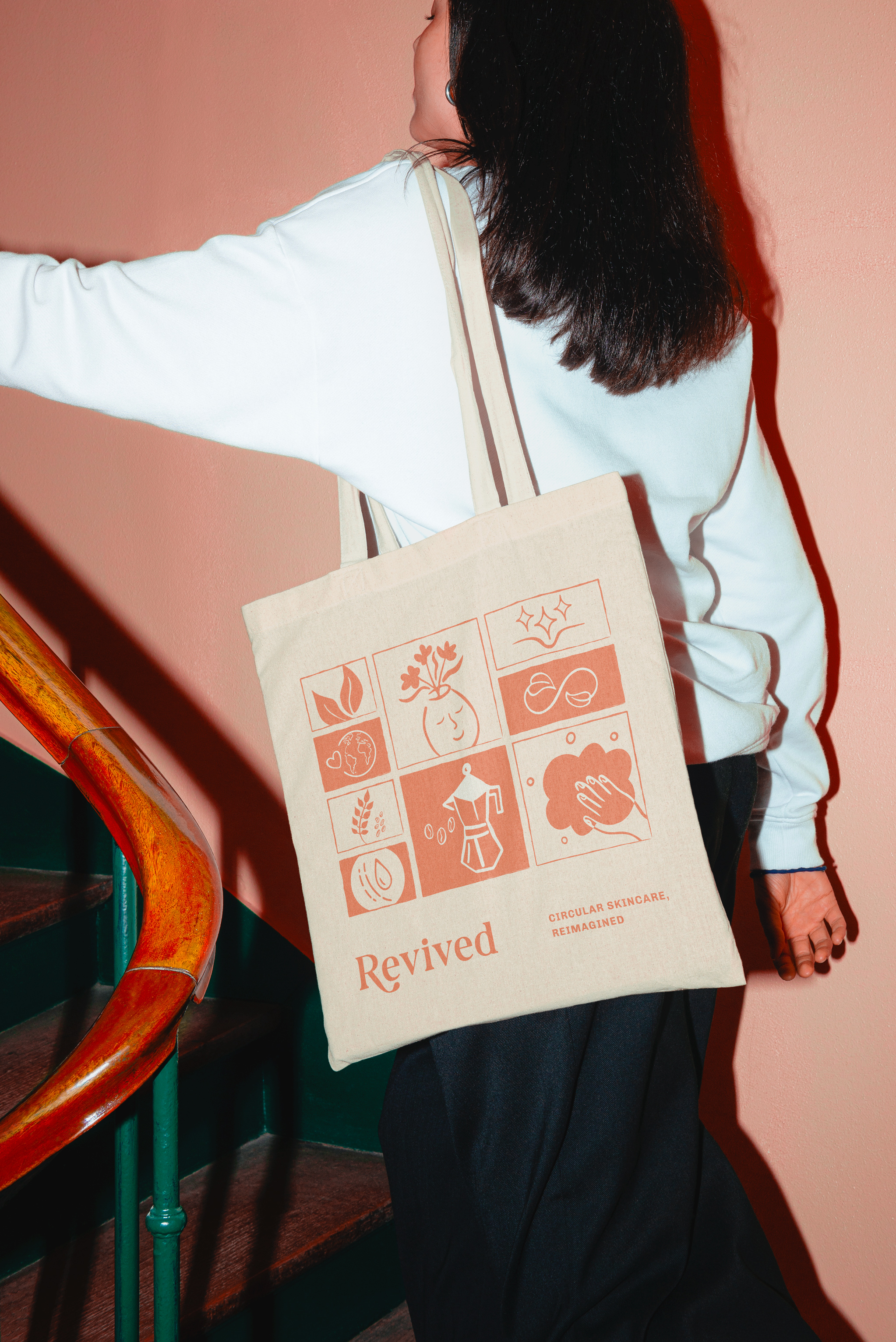
Revived's photography focuses on real life, relaxing yet relatable moments e.g. drying face, tying-hair, closed eyes. Tactile, hands-on shots showcase the products being used. Brand photography also uses soft hues and soft lighting to evoke a sense of tranquility and escapism.
Revived packaging boxes in both 3D and 2D. On the left there is a dark pink 150ml box and on the right there is an orange 30ml box.List of 13 illustrations and descriptive text. For example, cleansing, moisturising and cruelty free icons are included.Two images, on the left a selection of coloured paper showcasing Revived's illustrations. On the right, a poster advertising Revived.On the left are hands opening the serum bottle, on the right are hands opening Revived's Mocha body scrub.Collage of images - girl drying face with orange cloth, hands interacting with the serum and placing it onto face.Hands using Revived's Mocha Scrub on arms.

"Cool About It have been brilliant to work with and they have been integral in bringing our new skincare brand to life from initial concept discussions right through to the product launch, perfectly conveying our brand identity and mission."

Scott Kennedy
Co Founder
< Previous projectNext Project >